Disgusted Manual Reader
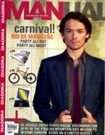
 Manual is a monthly, locally published men's fashion and lifestyle magazine under Mega Magazine & Publications, Inc. (MMPI). I own every single one of its issue from when it first came out in April 2003, then under the able guidance of its editor in chief, Vanni de Sequera. It has balanced articles on sports, current events, the latest gadgets, cars, travel, fashion, and style. It's Dear Mentor, Wanderlust, and Bitchin Bartender sections are something to look forward to month after month.
I bought the November 2005 issue and excitedly tore the plastic covering apart. As ordinarily satisfied as I was for the other new issues as I browse the content, there's just something amiss with this one. Like a bad aftertaste or something similarly disgusting as cheap sex. I tried to lay my finger on my source of discontent and, to quote Archimedes minus the act of going out of the public bath and running in the streets naked, I almost exclaimed, "Eureka! I have found it," out loud.
I have expected some change coming after RJ Ledesma became editor in chief starting October 2005. Right as I was, things generally shifted and, um, regressed.
Noticeable is the change in overall layout when they began using an all-upper-case type set in black colored Arial Black font (most in solid black color) from the table of contents to the title of the articles and the short key-sentences that is supposed to summarize what the whole writeup is about. Not only that it's hard to read in this format, per wikipedia.com, all-caps usage generally connote "shouting" or "attention seeking."
First the font, then there's the blasted comment inserts of the editor-in-chief in eight of the issue's articles. In Tim Tayag's column found in the last few pages of the magazine entitled "Luxury on a Budget," for instance, Mr. Nosy Editor-in-Shit made this insert in the first paragraph of the writeup: (Hey Tim, are you e-mailing this to me from your wireless roaming laptop while cruising around in your dubiously government plate numbered BMW? - ed). In the same article, (Don't project, Tim - ed) and (Ha! - ed) was also thrown in all in the name of poor taste. That's three inserts in one section and it totals to six-fucking-teen for the entire issue! Lame man. Take a crash-course in journalism and come back when you're cultured enough. Bitch! - ed.
Manual has been tantamount in marketing vanity products targeted on men. It was in this magazine that I first cringed on the sight of a man being exfoliated before being subject to a facial beauty mask. It's style section would also normally feature stuff that look really great like shoes, suits, bags, and hair products complete with ways on how to wear and use them thus saving us the embarrassment of asking a sales person for a demo in the mall. This month's style section, however, featured a man and woman in pre-war era clothes. There's also this two full pager of the female model whose cleavage and collar bones were obviously re-touched via airbrush (for enhancement) which could have been alright had Manual been a hair-and-makeup-cum-cosmo magazine! They may have also been expecting their audience to drool over the ornate old cars and mansion and just wear hats with a suite again after the reading experience.
On a final note under their fashion section entitled "Geek to Sleek," eight pages of images and text were devoted to following the developments on the make-over done on some Angelo Mañosa, or Gelo, like anyone actually cared. They dressed him up in 2-pleated business slacks which seemed to be made in the 90s. One photo even has Gelo in very light grey colored casual pants and brown strapped sandals which did not at all make him look gay. And I'm Brad Pitt. Right. They could have actually saved this section for a reality TV that specializes on making helpless souls look less fashionably helpless.
In operating for over two years, Manual must already established its niche in the local market with both male and female readership (evidenced by the mail-in comments, suggestions, and reactions page) that no other local men's style and lifestyle magazine could beat at present, in my opinion. They have continuously served a variety of interesting articles with fresh helpful insights to maintain it. A single issue could spell some irreversibly bad consequence for the stature they have all worked hard in reaching.
I'll still buy the December 2005 issue, for old times' sake. I hope it doesn't call for my performing an exorcism ritual at their office when it comes out (with me saying: demon, be gone!).


:
ano ba yan, di ba niya alam na hindi rin madaling basahin ang all caps?! hindi siya dapat ginagamit sa mga publicaitons.
hay nakoh. kainez ha.
syempre, i misspelled publications.
at syempre, kinorrect ko pa ang sarili ko. :D
haha! eh yung black font in addition to the all-caps? pucha, pag nakita mo gusto mo nalang sunugin. wala akong nabasa ni isang article. overwhelming pag tinitignan palang. overwhelming in a negative tone. paksyet!
Post a Comment
<< Home